TYPE DESIGN
As my graduation project I chose to explore the rules of type design.
I sought to push the limits of what is possible without losing balance or function
within a typeface. By trying out different ideas and letting the pen lead the way,
I found shapes I didn't expect. The process, my hand and my mind guided
me towards shapes that eventually turned in to individual letters.

This project started as a pure passion for type design. Like most children, I started drawing before I could write. From there on I simply continued on that path, without
realizing how I could use that knowledge as an advantage in design. For a long time
I drew abstract shapes, finding words or letters within them, and eventually turning those shapes into a functional skill within my designs.
Type design has become a fundamental part within my most recent works; it holds identity as well as a communicative role. Most well-renowned businesses have their own font, crafted by very skilled people. That handicraft was something that
I wanted to explore further.
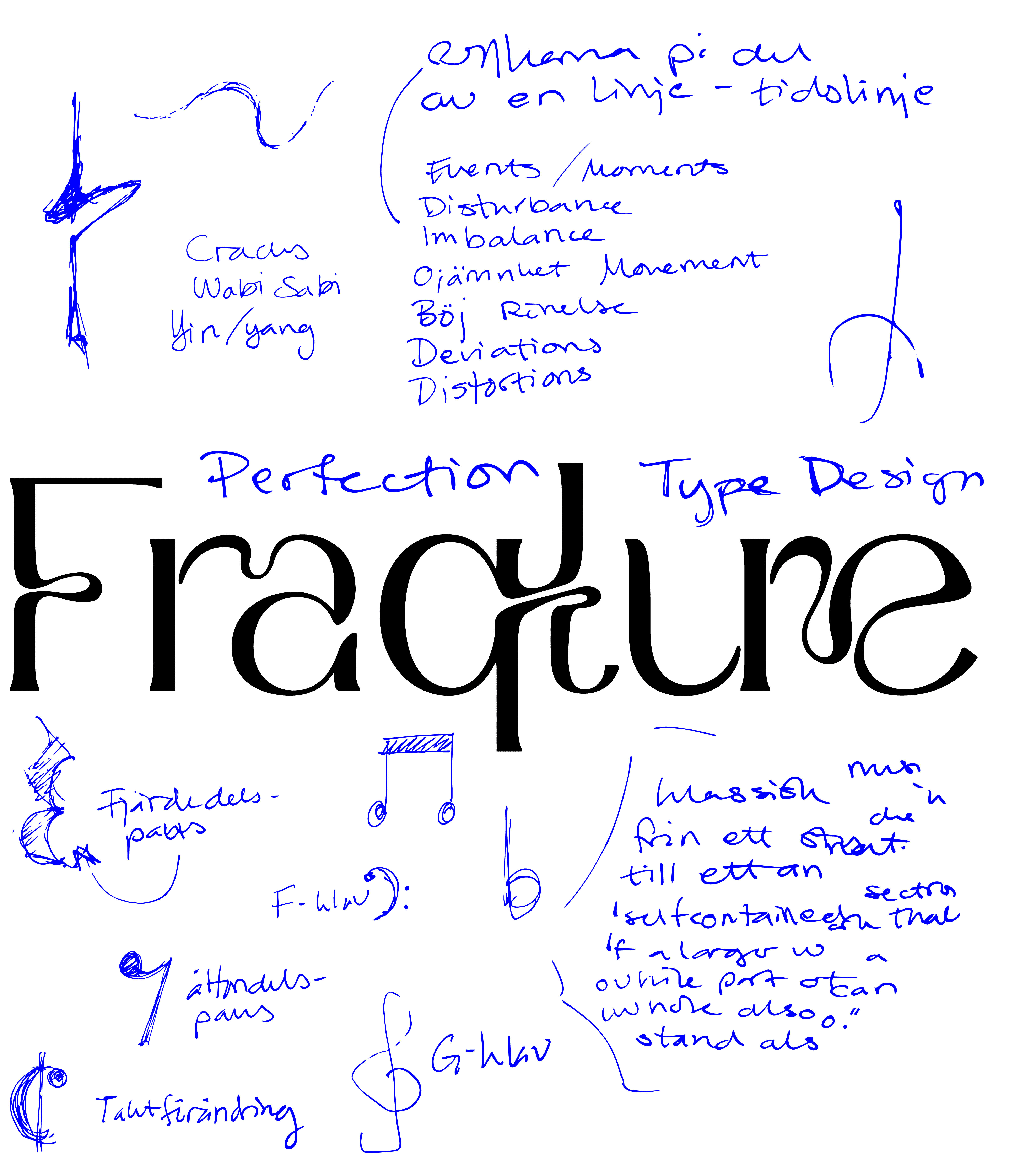
This is where Fraqture was born. I knew I had to dive deep into the process to learn the craft, while also finding my own style. My goal wasn't to reach perfection but an exploration of the human hand within a digital framework. I wanted to see where the process would lead me when letting go of perfection. Because no process is linear. This led me to distortions. Instead of trying to hide the errors, I began to embrace them. I gave them names, turning moments
of frustration into a structured anatomy.
That is how Fraqture became a process with no definite finish line. I realized that perfection is no longer desirable.
The beauty lies in the attempt.


CAP HEIGHT
X-HEIGHT
BASELINE
CURVE
The shape serves as a foundation to most letters of the typeface. It was the first design element to take place during the process. The soft, fluid feeling acts as a contrast to the otherwise sharp edges.
FRACTURE
A sharp, structural break which looks as if the letter has ruptured at the stem.
The distortion keeps a balance between the soft bowl of the letter.
ARC
Inspired byt the foundational curve comes the arc.
The distortion lies in the shape itself, with a soft drop and a sharper arc at the top.

LIGATURES
The ligatures were designed to bridge the gap between the structural rules of type design and the fluid, unpredictable distortions that define Fraqture. Instead of keeping the characters isolated, the ligatures allow the elements to physically spill into one another, making the transitions feel organic and partly deliberate. Since the backstory of this typeface is rooted in the unintentional, it embraces the imperfections that grow throughout the process. Creating these custom (and sometimes unconventional) ligatures ensures that the typeface retains its strong artistic character.

EDUCATION
Forsbergs Skola 2024-2026
Graphic design and marketing
Konstfack 2013-2018
Master of Arts, Visual arts educator
CONTACT
TOOLBOX
Adobe Suite
Photoshop, Illustrator, InDesign,
After Effects and PremierPro
Glyphs type design
Figma, design and cooperation